macOS 27 Golden Gate Beta
Article
It's still in developer beta but here's a look at some of the visual changes that are coming in the next macOS release.
Corner Radii
Let's start with a change that received a round of applause from those in attendance at WWDC. They've reduced the corner radius and all applications will, once again, have the same radius.
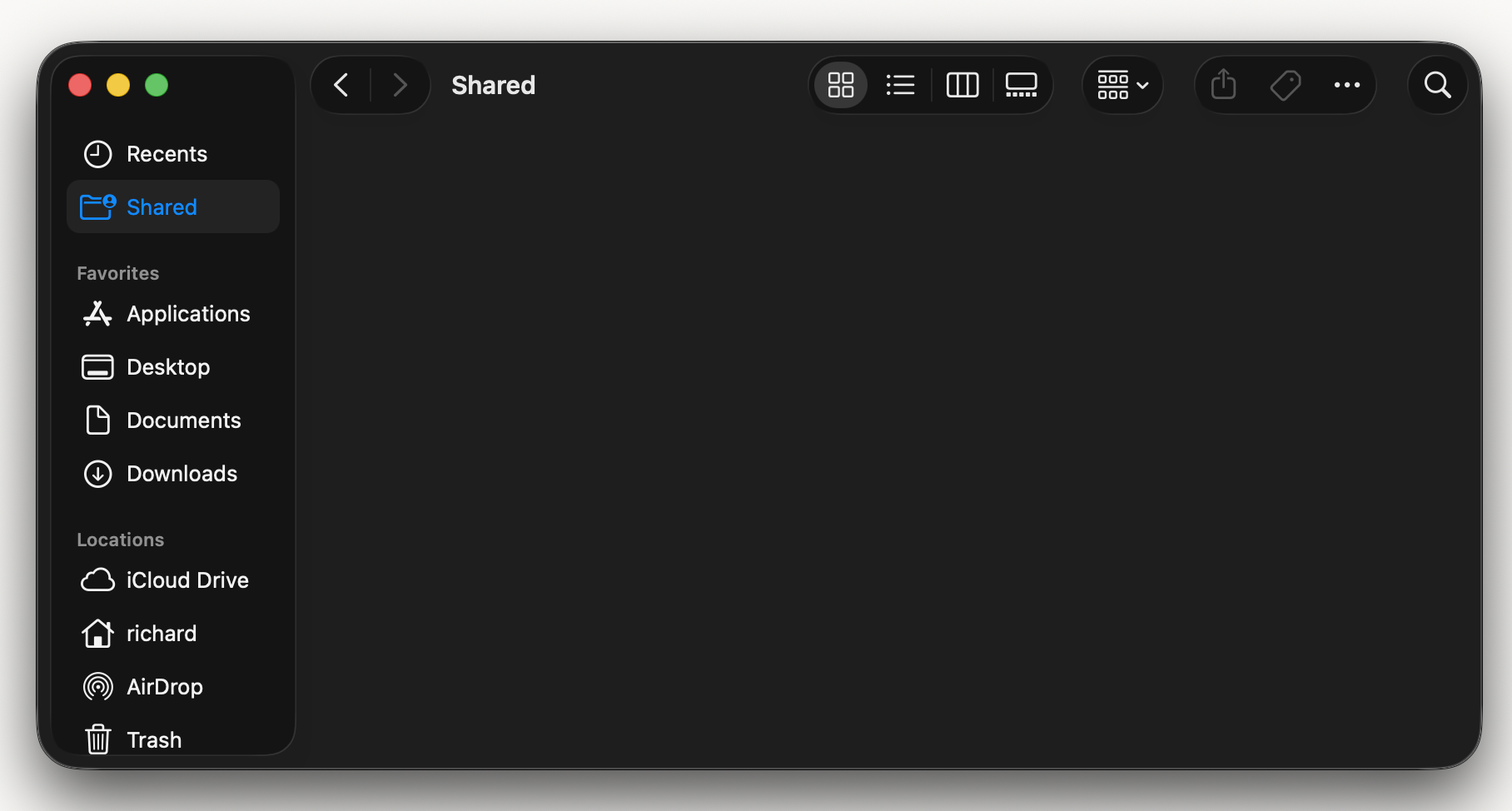
Sidebar
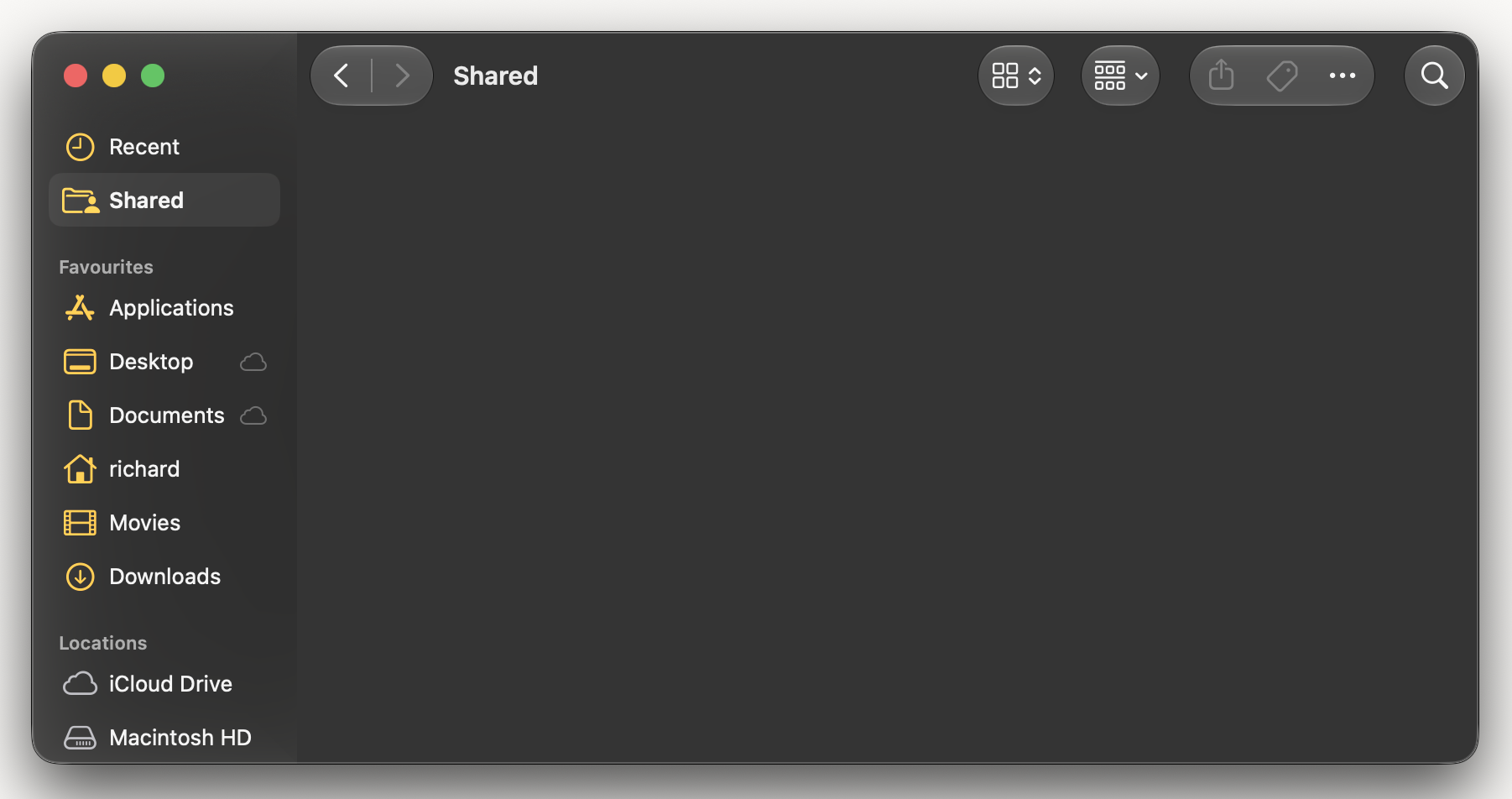
The weird island is gone and the sidebar once again stretches to the edge of the window. All of the icons in the sidebar are coloured now. In Tahoe the unselected icons were all white.
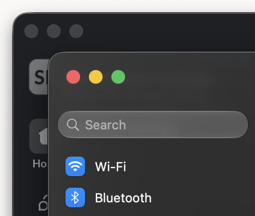
Menu Icons
The additional menu icons that were added in macOS Tahoe have been removed. Menu icons are once again used sparingly, where they add real meaning. Otherwise simple text items are used.
App Icons
App icons have been updated as well. They have stronger, more defined edges, as well as having reduced faux glass effect. For me it's a somewhat rare case, where a new design immediately makes the old design look dated. The app icons in macOS Tahoe look blurry in comparison.
Liquid Glass Slider
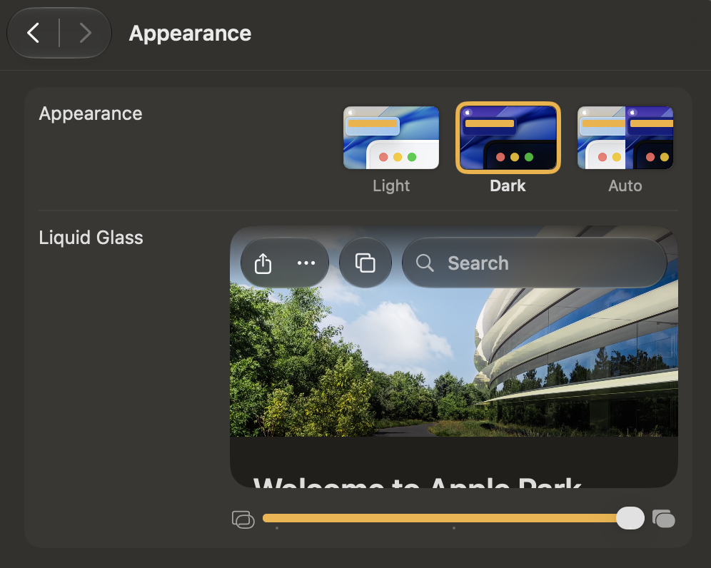
Your level of preferred glassiness is now adjustable under Appearance in System Settings. My preference is to set it all the way to the right.
Conclusion
Taken individually these are all small things. But collectively they show an attention to detail that was missing in Tahoe. This level of attention to detail is what we've come to expect from Apple and it's what makes the Mac's user interface a joy to use.